Cultist Simulator: the Renewal of Skin
Hullo all. I’ve been quiet for the last couple of weeks, because I’ve been off in Kyiv (at Casual Connect, where I did a talk) and Paris (at Indiecade, where Lottie did a talk for Failbetter). But meanwhile Martin has been finishing up tweaks and improvements to the UI, so I have an sheaf of things to show you. Please imagine that I am somehow fanning them like a hand of cards.
First of all, here’s where we ended up after the last blog post about timing:
There’s a fast-forward button! And Pause is still just Pause. I may still experiment with uber-slow-not-quite-pause (and a hard pause if you hit escape, to answer the door or change babies, which locks out the UI until you unpause), but that will be an experiment to gauge feedback, because a lot of folk were worried about it.
Lots of things in here.
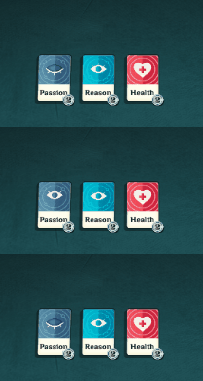
(i) you can specify your name (though I have to work this back into Legacies before it’s active)
(ii) the game will notice, in a fairly broad and relaxed way, what you’re doing, and describes your occupation as the world sees it. [The direct inspiration for this was watching Lottie play Titan Quest, and remembering the fun way it reflects your skill tree choices with descriptive profession names.]
(iii) there’s a summary bar showing key resources at a glance. This was Martin’s idea, and I wasn’t sold on it initially, but I respect his instincts enough to give it a try, and it’s an easy experiment. We’ll see how useful people find it.
(iv) the Funds icon is still that awful half-baked one that I pulled out of a free Unity asset pack. I have Clockwork Cuckoo working up a better one right now.
Nothing is happening in the gif above. Everything is as it ever was.
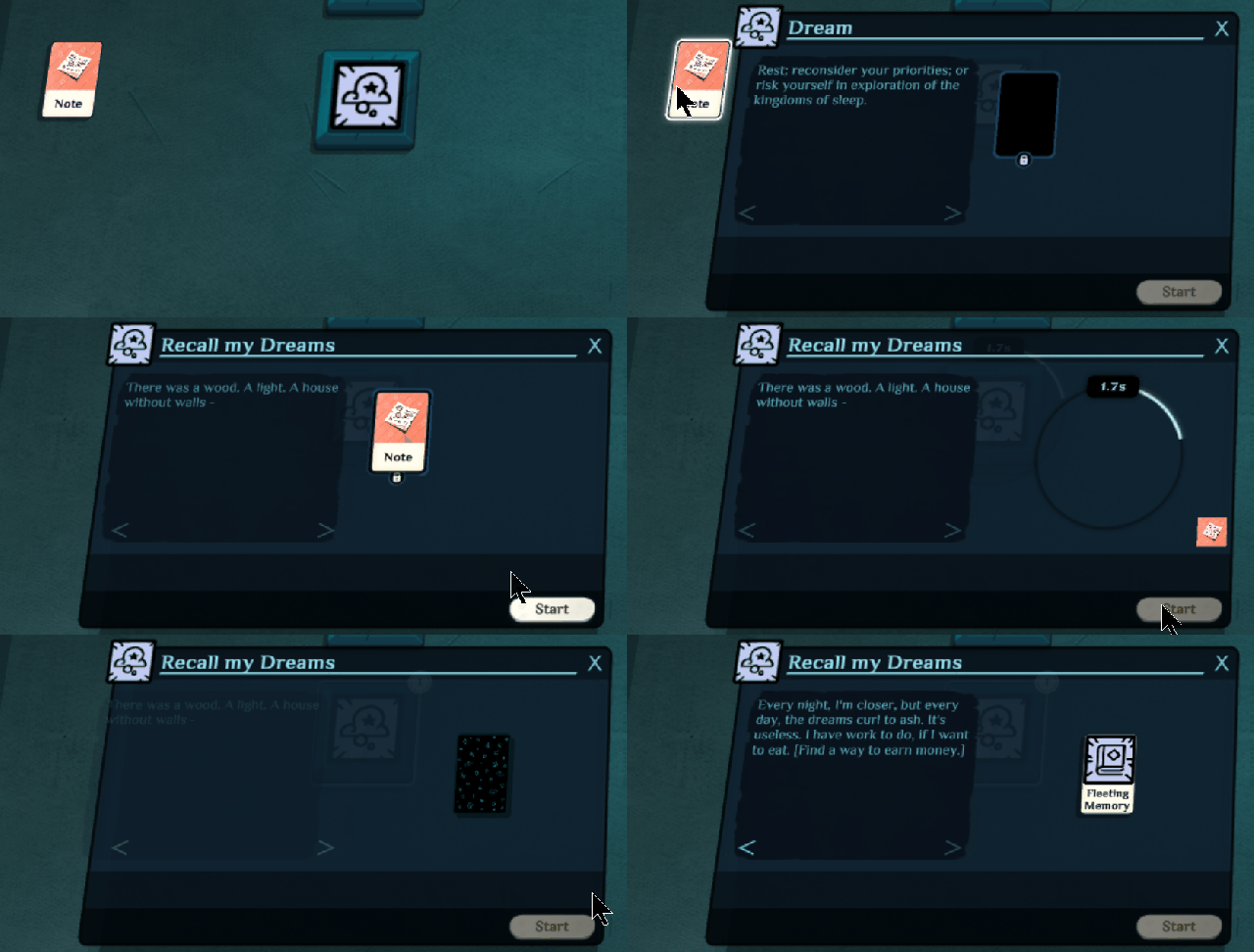
Okay’, here’s the meat of the work: a complete situation window do-over. Some of the key changes:
(i) animations and transitions. As a system-oriented, text-centric sort of chap, I never realise how much difference these make until they’re in, and Martin will not be the last UI person to give me justified side-eye on that. Anyway they make everything way clearer, admire them!
(ii) cards in a running situation jump into the corner and use up less space. We could use some sort of transition there, actually, but let’s see how it reads without.
(iii) sexy little card-flip there at the end to indicate something new showing up.
(iv) The text! it gets much clearer placement, and you can scroll through previous messages. I’m backing right off my previous desire to limit text readability to ensure enthusiasm and anxiety. I just can’t justify it in terms of player experience.
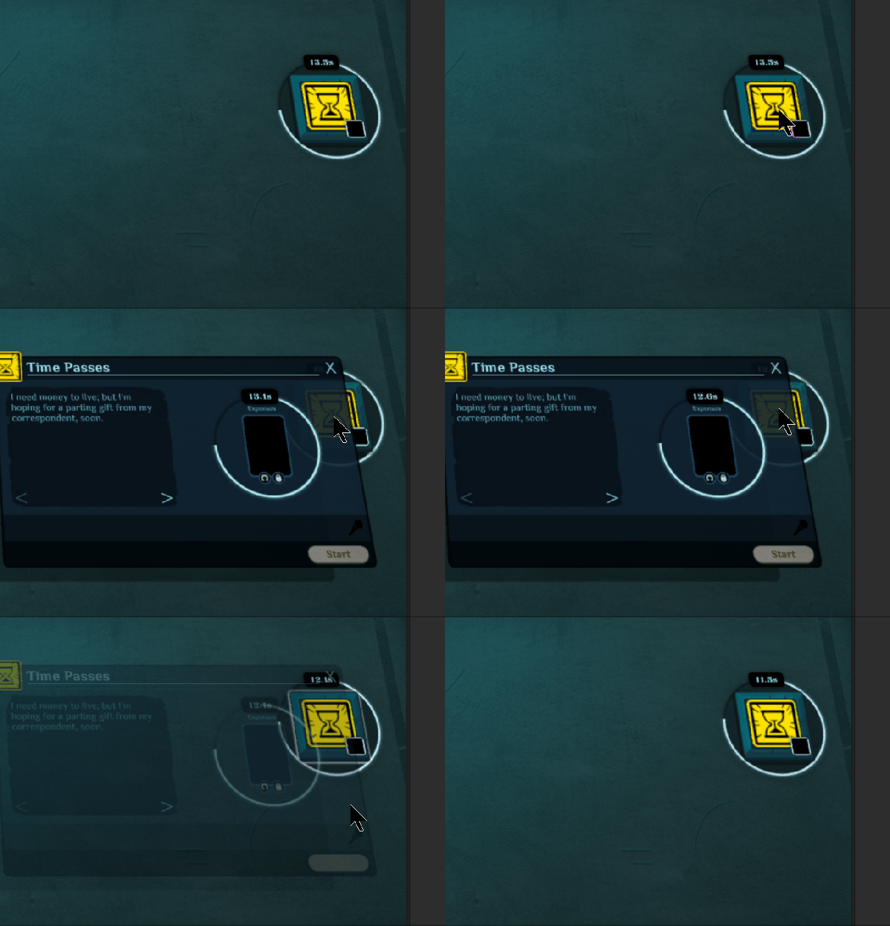
(v) The verb tile has an echo in the top LHC of the window, rather than the window being anchored to it directly. This makes a lot more sense when you see this:
Windows are much smarter about where they open. Here the window knows not to open off-screen. There should be much less fiddly-jiggly damnit-I-can’t-read-the-slot. Especially cos, yes, the zoom now finally works.
So when can you get this in a build?
I have a bunch of niggly bugs to work out of the new UI and its consequences; and content production has slowed right down while we work on the UI, especially because I want to see how a lot of content looks different in the updated version. So I need to sort out the bugs, and finish off the half-baked Scholar content that’s in there right now. I think we’re talking a couple of weeks. But the only thing I’m committing to (though I am committing to it) is ‘early Perpetual Edition builds by the end of the year, probably sooner.’
Thanks for following along! Here’s the mailing list for Cultist Simulator, if you’re not already on it. And here, if you like the work that Martin has done above, is the link to his game.


I really like the UI transitions. The scaling, fading, animations etc. all look really smooth, and they’re the sort of things it takes ages to get perfect so people don’t even notice them.
They’re the sort of things I would scoff at (“Ha! It’s not the real game, just distracting frippery!”) until I saw it working, and then realise that it a) looks totally sweet and b) makes everything clearer.
A thought about the pause and timer mechanics: you might want to have some way of calibrating for people’s reading speed, and you definitely should have a mode in which the game proper is frozen and the player can read back through all previously-seen text at their leisure.
Everything looks so much cleaner and intuitive!
I do want to say that being able to play on pause means so much for accessibility for a whole lot of people. Even if you only include it in an “easy mode” or something, please keep it in in some fashion so that everyone who backed the game under the assumption there would be a pause feature can still play it.
Great improvements! Having spent some serious time on the alpha build so far, these little tweaks will make it a lot easier to keep up with the flow.
Speaking of “keeping up”, I agree with TooMuchCinnamon (though there can never be too much cinnamon) in that a true “playable pause” feature is key for accessibility. I’d like a difficulty toggle for folks who can and prefer to play with the “sense of urgency” or whatnot without a playable pause, but need to not let others’ ability to thrive that way hinder the options for the rest of us! Different brains work different ways, and this accessibility is key for those of us whose brains click down those different pathways.
If the argument is “immersion and realism in a realm of forbidden seeking”, think of it this way: seekers of the hidden views do so because they already see differently. For some, this difference makes their window on the world swifter, edgier, thriving on the sense of danger and excitement. For others, it takes a few moments to arrange newly-cut pieces of glass so that the colors and shapes can fit into the kaleidoscope. For these, having to turn and twist too quickly makes the shapes too jumbled, the stress unfun, the jagged edges cutting off what should be clear…
…unless that moment of timelessness is retained, in which all is made crystalline and aligned in the space of no-time, the Playful Pause.
Please don’t take away our Playful Pause. 🙂