THE MOTHER OF ANTS
Sarah Gordon (@notsarahgordon on Twitter) has been putting together some more quasi-Tarot for the Hours in the Cultist Simulator setting. She has access to a lore spreadsheet with details and correspondences for each Hour, but I have finicky and demanding requirements and we usually go through at least one round of changes.
But one of the things I like about working with concept artists is that they’ll often have good ideas I haven’t thought of, that I can then incorporate back into the lore. This is how the Moth’s barber-affiliations first came about, although it’s core lore now; and it happens again below.
Here’s our conversations about the Mother of Ants card. SPOILERS!
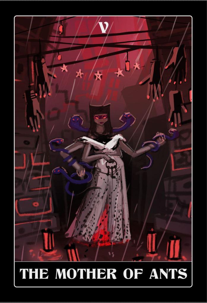
SARAH: Mother Of Ants. What we’re looking at: a be-wimpled, ostensibly female, quite possibly pregnant figure with six limbs and somewhat insectoid eyes, holding a ring of keys, surrounded by a cityscape of drawers and windows. Severed hands are hanging above her, red lanterns at her feet. the dots you see will be ants swarming up her bloodied skirts (I think). Along with the keys clasped to her belly, she’s currently holding five snakes – was trying to figure out a gorgon reference… I don’t think this looks right, so will have a think about something else she could be holding. Lots of options. Was also considering giving her a couple of wounds, but wasn’t sure if that would be a bit too grim for this one (hanging severed limbs may get this aspect across anyway).
Colours Probably need a bit of a tweak.. we don’t have anything in the spreadsheet about that right now, so if you have an idea about where she should be on the spectrum do let me know, otherwise I’ll intuit something.

AK: Colours! Let’s go with rich imperial purple, to match the colour we’re associating with Knock in the game (the purple shade in the spreadie) with red accents. Purple eyes would work well.
I’d definitely like to make her definitely not pregnant, specifically because birth and pregnancy are the prerogative of the Grail, and I don’t want to mix the attributions up. (She’s called the Mother of Ants because [REDACTED]; I can immediately see why that was misleading!) I’d like her to be thin, strikingly so, to suggest snakes and ill health.
I like the hands, I like the lamps. Wounds: if in doubt, always go grim on this project. 🙂 What I had in mind with this Hour was the Gothic trope of unsanctioned penetration of an interface: where there is a sense of ‘should not’ because the things on either side are very different, because it is gory, because it is queasily sexual, because it is the result of harm or an accident, or all the above.
So how about this? tell me if it won’t work compositionally:
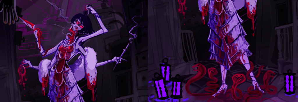
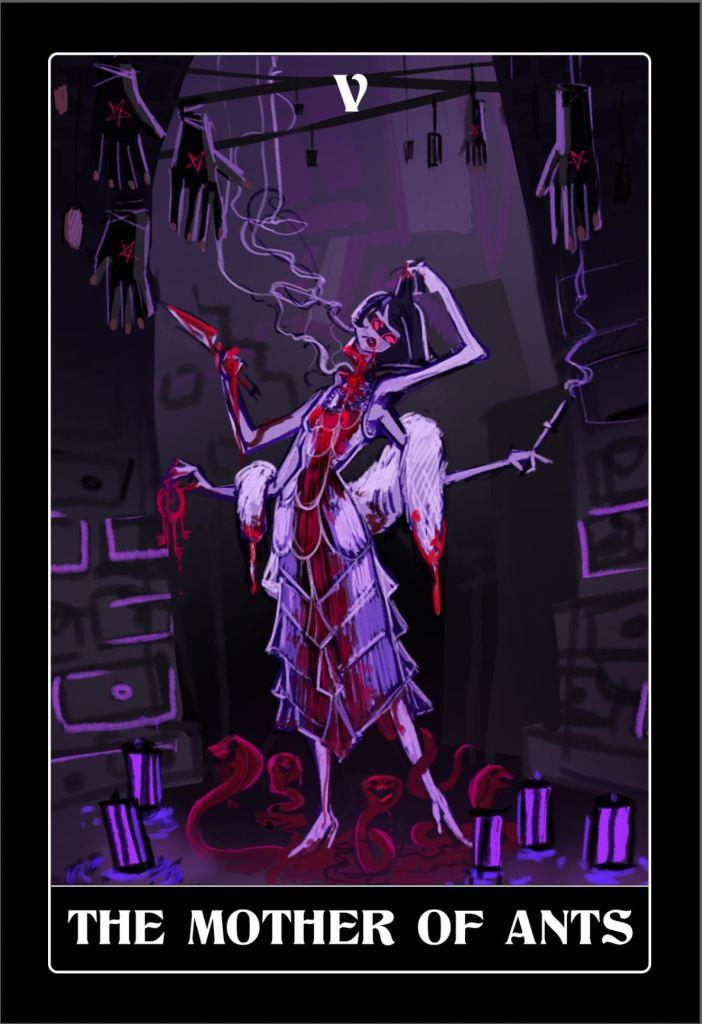
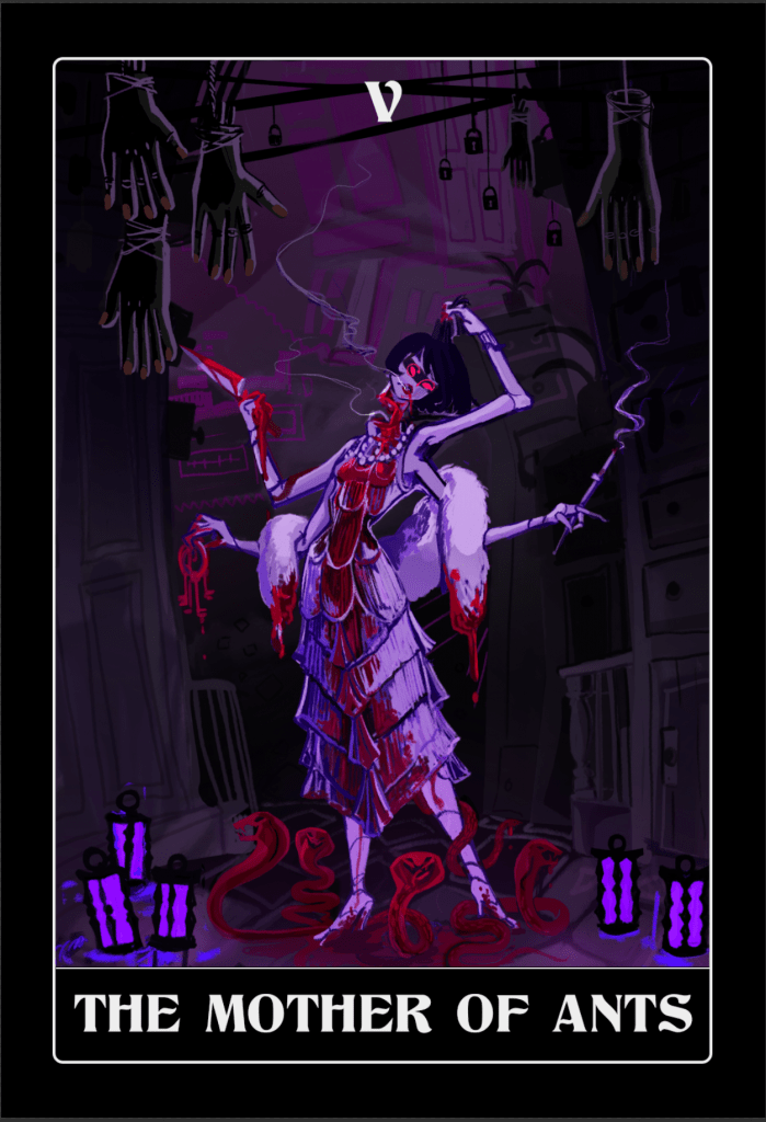
The Mother has cut a deep wound in her own neck, so that it’s almost severed. She’s holding her head at a forty-five degree angle in one hand, and she’s obviously still conscious and looking at the player. I like the zero-shit-taken expression on her face in your sketch: it reminds me of a gif I just showed to Lottie, here: https://imgur.com/gallery/o0RWXp1. In her other hand she should be holding a knife or cleaver, to make it absolutely clear that this is a self-inflicted in-control thing. Where the blood spills on the ground, snakes should spring from the blood: this gives us our Gorgon reference (Medusa’s blood [REDACTED], depending on who you listen to).
I also like the idea of a snake pushing its head out of her half-severed neck, for an extra grotesquerie and a suggestion that she’s opened the way. Lottie has pointed out that this may (a) distract from her expression and (b) suggest ‘lady snake pinata’. Please use your judgement and/or provide a couple of alternatives: I’m now undecided.
And finally, can we 1920s her appearance up? I like the idea of giving her a 1920s bob – partly because of that hat check girl gif, but it would be a nice incongruity, and I’m not sure how the severed neck would work with the wimple. All these cards immediately become less fantasy and more unusual when they have more period details, so generally I would push you in the more 1920s direction as well as the grimmer direction. (I think you’re responding to the Sumer reference in the row, in the original composition. Generally that’s there for historical / lore detail for my reference, and usually I wouldn’t need you to go to the Hour’s origin.)
Sarah: Changes made mostly to order. Tried having one of the snakes crawling out of her neck and it just seemed to confuse everything up there in a bad way. So am instead suggesting maybe having smoke rising out of her parted lips and her neck wound (am sure you know that girls with bobs smoking cigarettes was considered very sexy/kind of lesbian – doubly so if the smoker with the bob was also a mermaid). There’s also a bloody snake winding up her leg below her skirt. Hopefully a bit on the queasily sexual side. Too vulgar? I don’t know. Let me know. This may take a bit of tuning in before I get the level with this sort of stuff right.


Looking awfully fantastic, and fantastically awful! I also wanted to say I really love how some of your card portraits have touches of subtle animation. It reminds me of the animated cards in Armello (another KS indie fave with some gorgeous cards which can be seen here https://giphy.com/explore/armello ).
Anyway, since you have several WIP versions of each image (which are all awesome in their own way), you could consider using the early versions as subtle animation which briefly flicker into view across the final card image. This could create a nicely unsettling effect as if briefly revealing hidden aspects of each Hour. Photoshop or free tools like Synfig (https://en.wikipedia.org/wiki/Synfig) can also be used to autocreate frames that are “inbetween” two given images for animation. Just some suggestions & looking forward to the final product!